RICE FRUIT
Sweet Natured
Born in the picturesque foothills of rural Adams County, Rice Fruit Company is located in the heart of Pennsylvania's apple country. Rice Fruit Company receives stores, packages, and markets fruit for over 40 farm families in the surrounding areas.
- ricefruit.com
Deliverables
- Brand Identity
- Packaging
- Web
- Illustration
- Product Photography


The Problem
With over a century of business behind them, they wanted to reinvent their identity. They needed a fresh approach with a nod to the past that would unify its visual communications and set the stage for the next 100 years.
Approach
Beginning with an audit of their existing visual identity and brand systems, it was determined that a new visual language and kit of parts would be most effective in setting the tone for their evolution. This included a logo, brand elements to be used in marketing materials, and packaging strategy, as well as design execution. In addition to growing and packing for third-party sellers, they bring fruit to market directly to the consumer. Therefore, the goal was to remain relevant and energetic, and fine-tuned for eye-catching shelf appeal.
Goals
Communicate the heritage while simultaneously embodying their bright future
Demonstrate they deliver high-quality fruit to the produce market
Speak to their local (East Coast) audience with a family promise
Deliver differentiated and energetic product lines and campaigns that win on the shelf
Inspiration
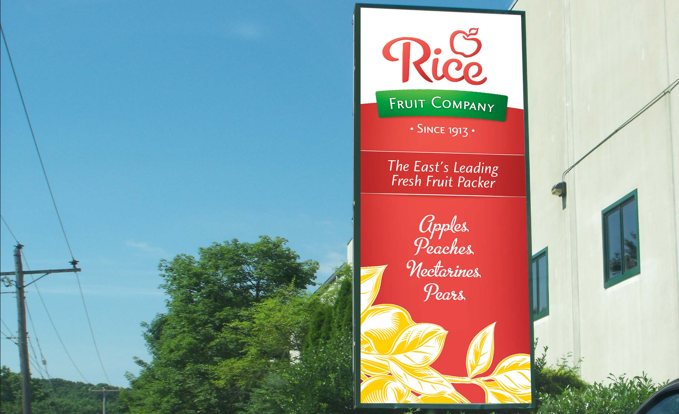
Original logos and artwork were the underlying inspiration. I paid close attention to mainstream health-oriented food brands. Fresh, friendly, clean, and precise, the logo has a sense of being connected with the past and present and the same time. Their name is short and concise. We presented several directions, but the typographic “signature” approach.
The heritage signature style logo was the winner. The graceful lettering is elegant, approachable, and heritage.
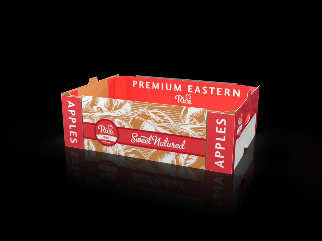
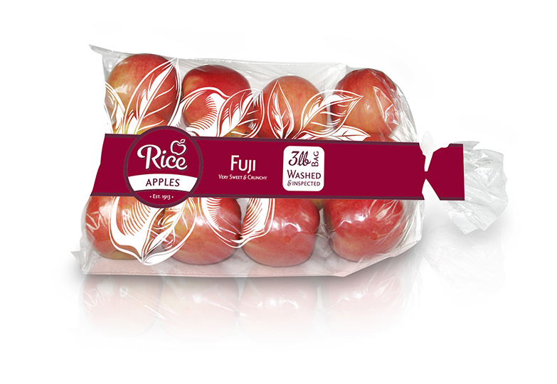
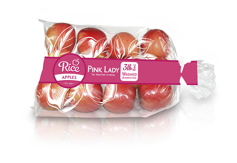
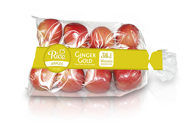
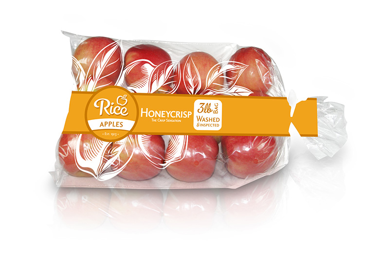
Signature Packaging
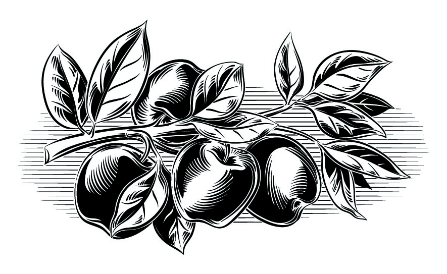
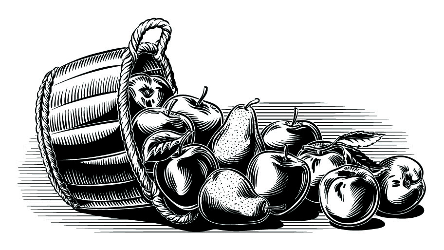
The visual code I developed for Rice Fruit balances nostalgia with a firm visual hook. Stylized illustrations have a heritage feel. The strip becomes central in delivering a strong foundational element that is connected to the placement of the logo. Varietal differentiation through color offers an at-a-glance distinction between apple choices.
E. Wenatchee, WA
elena@awdience.com
(360) 981-6754
